DUX ASG1
Revamping an existing Institution of Higher Learning Mobile App
Chosen App

App Name:
Institution of Higher Learning (IHL):
Purpose:
SUSS Backpack
Singapore University of Social Sciences (SUSS)
SUSS Backpack helps students to access interactive study guides, recorded lectures and past year exam papers conveniently. Important notification from the Institution can be received immediately and useful student resources are available. All these enhances students' learning experience in SUSS.
Persona

I started out with selecting my target audience, a student from SUSS who uses SUSS Backpack. I asked about basic information first, such as name, age, course and year of study. Then, I got to know more about her regarding their hobbies, favourite brands, software or tools they use often, which devices they use, their daily life, goals, frustrations, and what they aim to do to achieve their goals. This allows me, as a UX designer to better understand the perspective of a user and empathise with them. Lastly, I crafted a persona out of my target audience to summarise and organise all the information I have.
First,
Empathy Map
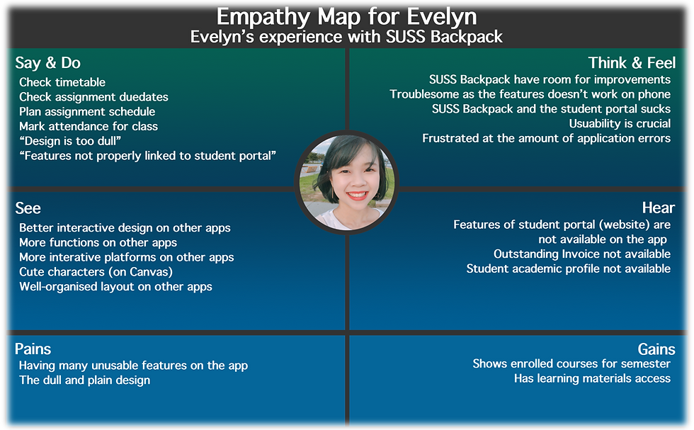
I also asked about her experience on the app and the comparison between SUSS backpack and other similar educational app she have used. I summarised it using an empathy map in terms of what she say and do, what she think and feel, what she see, hear, her pains and her gains. It appears that her experience with SUSS Backpack have been negative so far from SUSS Backpack's incomplete features and functionality. The empathy map is an addition to the persona to empathise with the user.
Storyboard
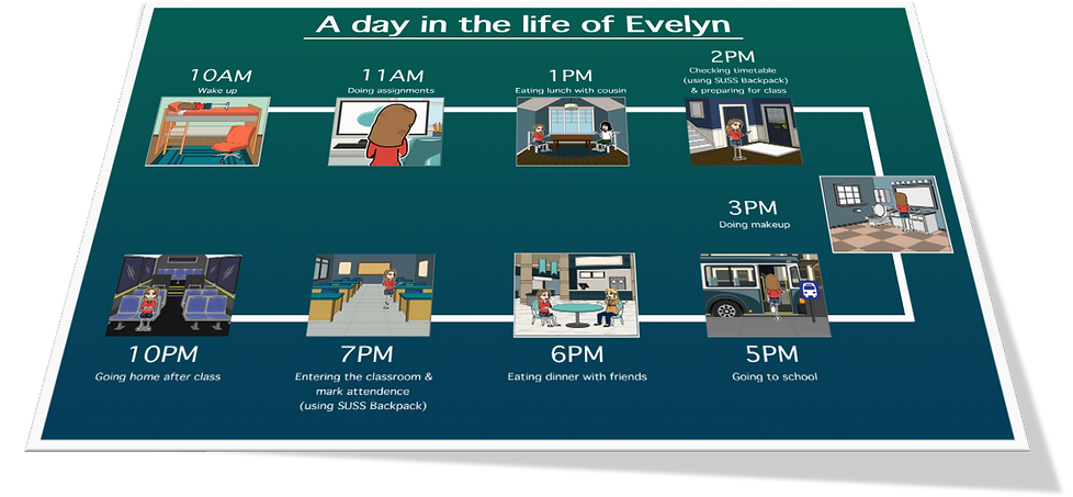
Another addition to the persona is the storyboard of a day in the life of my user. I enquired about how a school day in my user's life would be like and presented it as a storyboard. As my user only have classes twice a week, I showed her general routine in this storyboard. I specifically included two moments she would be using the app to show when and what she uses her app for. This has helped me to assign my main objectives for my UX design.
User Journey Map
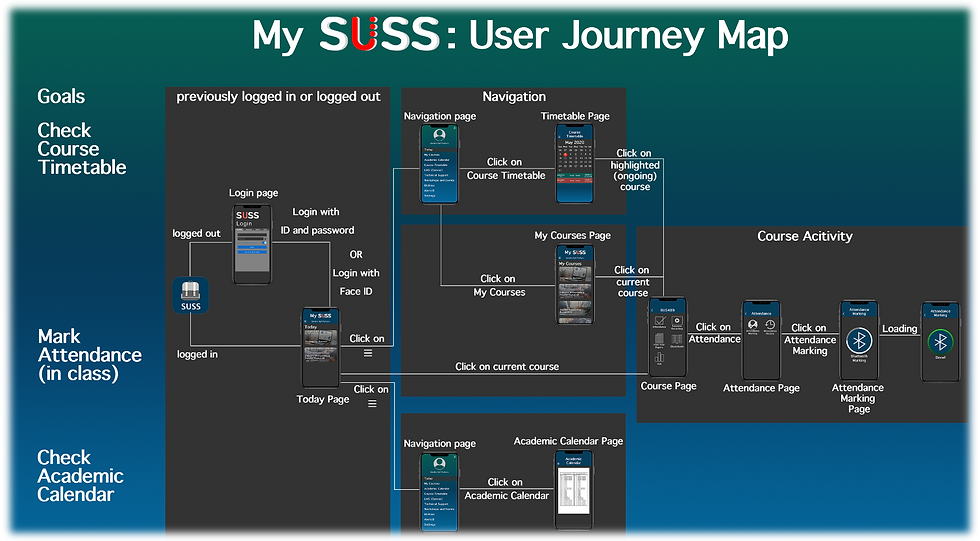
The user journey map has help me to visualise where user will head to to achieve their intended goal in the app I have revamped. I have categorised into different goals, specifically checking of course timetable, marking of attendance and checking of academic calendar. I later on further broke it down into the status of the application like if the user is logged in or out, the navigating user and user being in course activity section.
Competitive Analysis
App Name:
Institution of Higher Learning (IHL):
Purpose:
mStudent
Ngee Ann Polytechnic (NP)
Similar to the SUSS Backpack app, mStudent is an IHL application that helps students to check timetable and provide features to assist students in their daily life.
Home Screen


I compared the home screen and pointed out the main differences
mStudent
icons
hamburger navigation
displayed content
Timetable


SUSS Backpack
words
bottom navigation
I compared the timetable screen and pointed out the main differences
mStudent
horizontally arranged
displayed with coloured blocks
SUSS Backpack
vertically arranged
displayed in table and calendar
SP Mobile V2
Singapore Polytechnic (SP)
Similar to the SUSS Backpack app, SP Mobile V2 is an IHL application that helps students have a memorable learning experience.

App Name:
Institution of Higher Learning (IHL):
Purpose:
Home Screen
Timetable

I compared the home screen and pointed out the main differences
SP Mobile V2
icons
hamburger navigation
displayed content
SUSS Backpack
words and pictures
bottom navigation


I compared the timetable screen and pointed out the main differences and similarities
SP Mobile V2
horizontally arranged
has multiple timetable
has calendar
SUSS Backpack
vertically arranged
has class timetable only
has calendar
Login


I compared the login screen and pointed out the main differences and similarities
SP Mobile V2
student or public login
centralised
type login
SUSS Backpack
4 user login
aligned toward the top
has face id log-in

Canvas Student
Instucture Inc.
Similar to the SUSS Backpack app, SP Mobile V2 is an application that helps students have a memorable learning experience. This app is however catered to various universities in Singapore.
App Name:
Organisation:
Purpose:
Home Screen


I compared the home screen and pointed out the main differences
Canvas
2 by 2 layout
hamburger navigation
courses on home page
SUSS Backpack
words and pictures
bottom navigation
main navigation on home page
Course
I compared the course screen and pointed out the main differences and similarities
Canvas
coloured header
vertically organised
SUSS Backpack
plain and minimalistic
vertically organised
Final Prototype
Revamped App: My SUSS
Improvements
Instead of having a single lined layout, I noticed that most apps have icons and words in a grid layout in the home page to navigate into inner sections. It is more eye catching due to the logo as visual people would notice it due to it's colour contrast and size. Full page main navigation have been transformed into a hamburger navigation and I have kept the main colour schemes mostly, only adding another colour to the gradient. Home page has changed to be more customised to show students' classes on that day itself. A log out button have been added in the navigation to make it easier for the students to log out of the app if they want. I noticed that marking attendance and checking of class timetable are the functions more frequently used and determined that as my main objective when I revamped this app.

Mark Attendance
As marking attendance is one of my main objective, I made marking of attendance more convenient in my app. As you can see in the user journey map for marking attendance, only 4 taps is required to mark attendance given that you are not logged in. If you are logged in, that's even better. Only 3 taps is required to mark attendance from the home page.

Final thoughts
Over the course of this assignment, it really prompt me to think in the perspective of a UX designer to determined what I should change and shouldn't. It was the first time I have done a full scale prototyping and i trust that this will add on to my experience as a UX designer. I am glad to have revamped an entire app by myself with the intention of improving user experience.